EcoScan - CarbonGraph
A design sprint to mockup an AI for product impact assessment
Project Overview
I was excited to have the opportunity working with the amazing team at CarbonGraph, a startup focusing on building a sustainable future by making product life cycle assessment (LCA) accessible. When I joined the project, the startup was introducing EcoScan, an innovative tool that quickly generates the bill of materials and LCA reports with artificial intelligence (AI). By inputing minimum information, users can easily have an initial understanding of any product line, including its environmental impact, life cycle stages and supply chain.
Problem
While the purpose of the AI feature is to have an easy way of generating initial assessments, the process is complex and overwhelming with a diverse array of questions in order to reach the desired results.
Challenges
My primary challenge was understanding the different types of life cycle assessments and the process of creating these LCAs with a short timeline. I addressed the difficulty through communicating with the project manager and researching relevant content regarding life cycle and environmental impacts.
Role + Process
I conducted a design sprint to quickly turn the initial blueprint to a design-focused outline of EcoScan. In the process, I organized the user workflows and interface while designing the report outcomes generated by the AI.
Target Audience
Individuals who are interested in quantifying environmental impacts (e.g. internal product designers, sustainability teams, students, researchers), especially those who wish to quickly and easily assess impacts of various product lines.
Expectations and Deliverables
PROJECT SCOPE
Deliverables
Including the workflow, user interface, bill of materials and the LCA report generated by the AI feature.
Goals
Having a simpler workflow for users to easily complete each step in order to generate a LCA report.
Constraints
The short period of time given since the startup was about to showcase the project for potential sponsors.
SOLUTION OVERVIEW
EcoScan: A Preview of LCA at CarbonGraph
While the reports generated by EcoScan are low-accuracy LCAs, it is a quick and accessible preview of what could have been achieved when people join CarbonGraph. Essentially, the goal is to attract users to join CarbonGraph for better and more accurate LCAs.
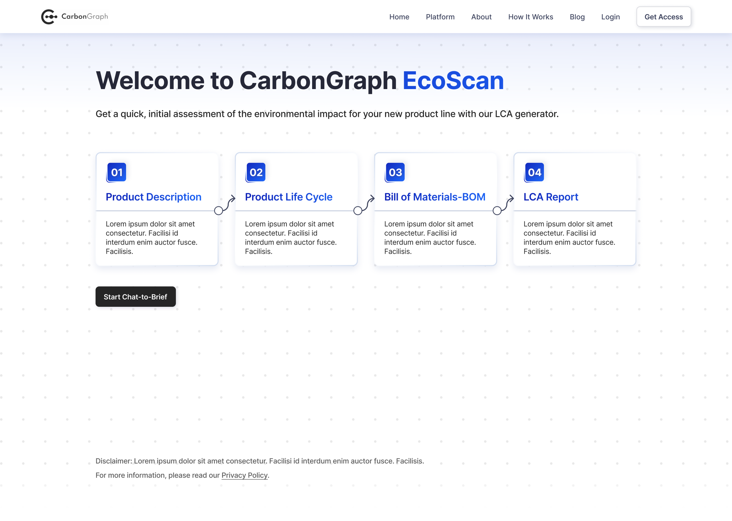
1. Landing Page: Easy and Quick Start
Users can start assessing right away by inputting information of a product while having a brief view of what to expect in the process.
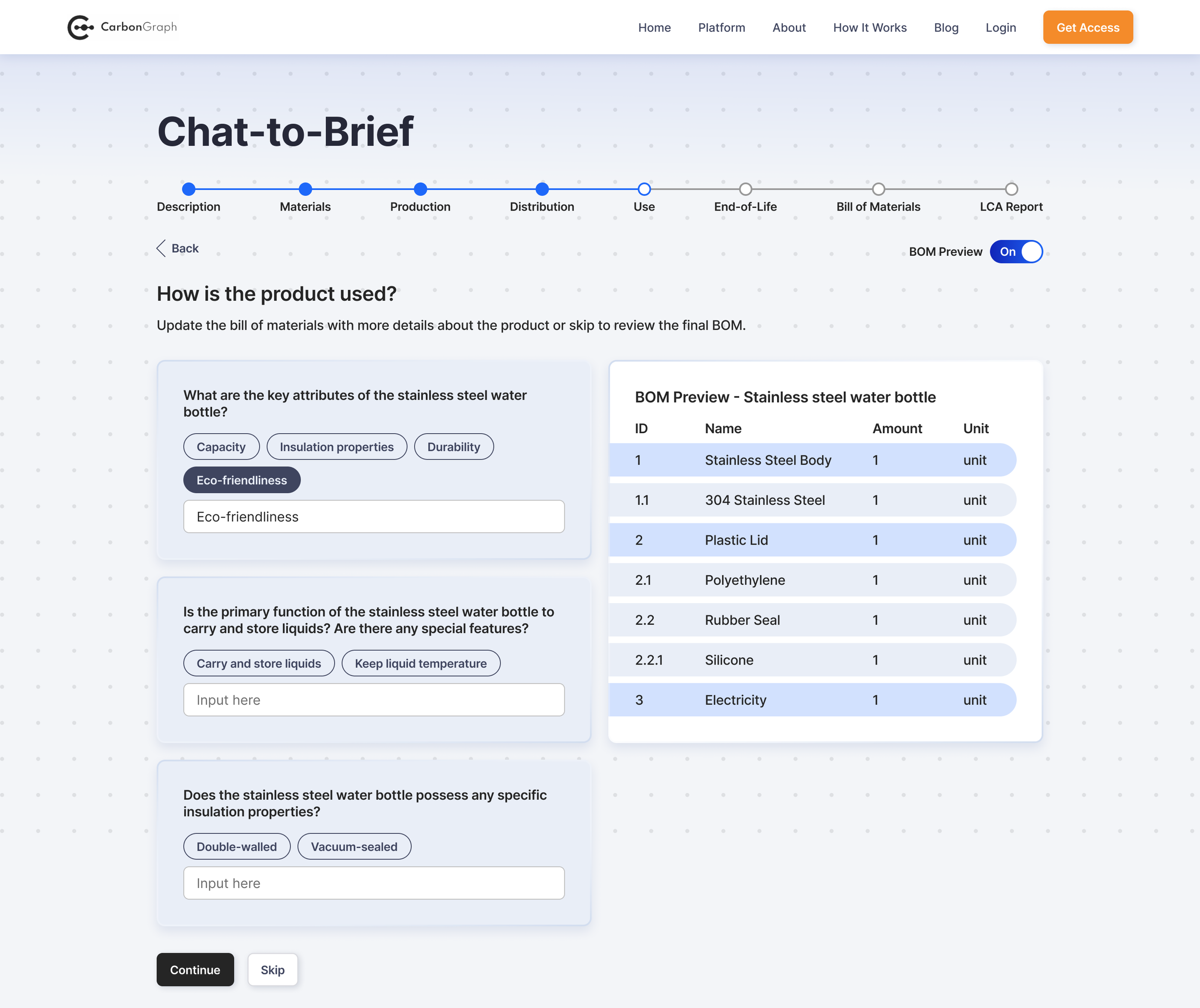
2. Assessment Process: Accessible Input and Preview
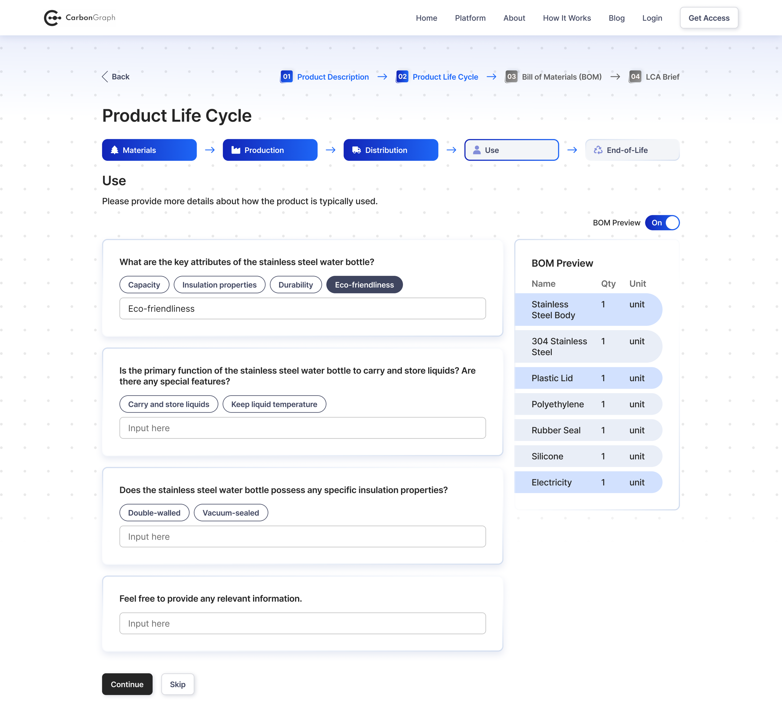
Users can directly input information or choose a suggested chip to complete tasks. An accessible preview for bill of materials (BOM) is provided for progress reference. Throughout the process, users can also skip any step to receive the final result faster.
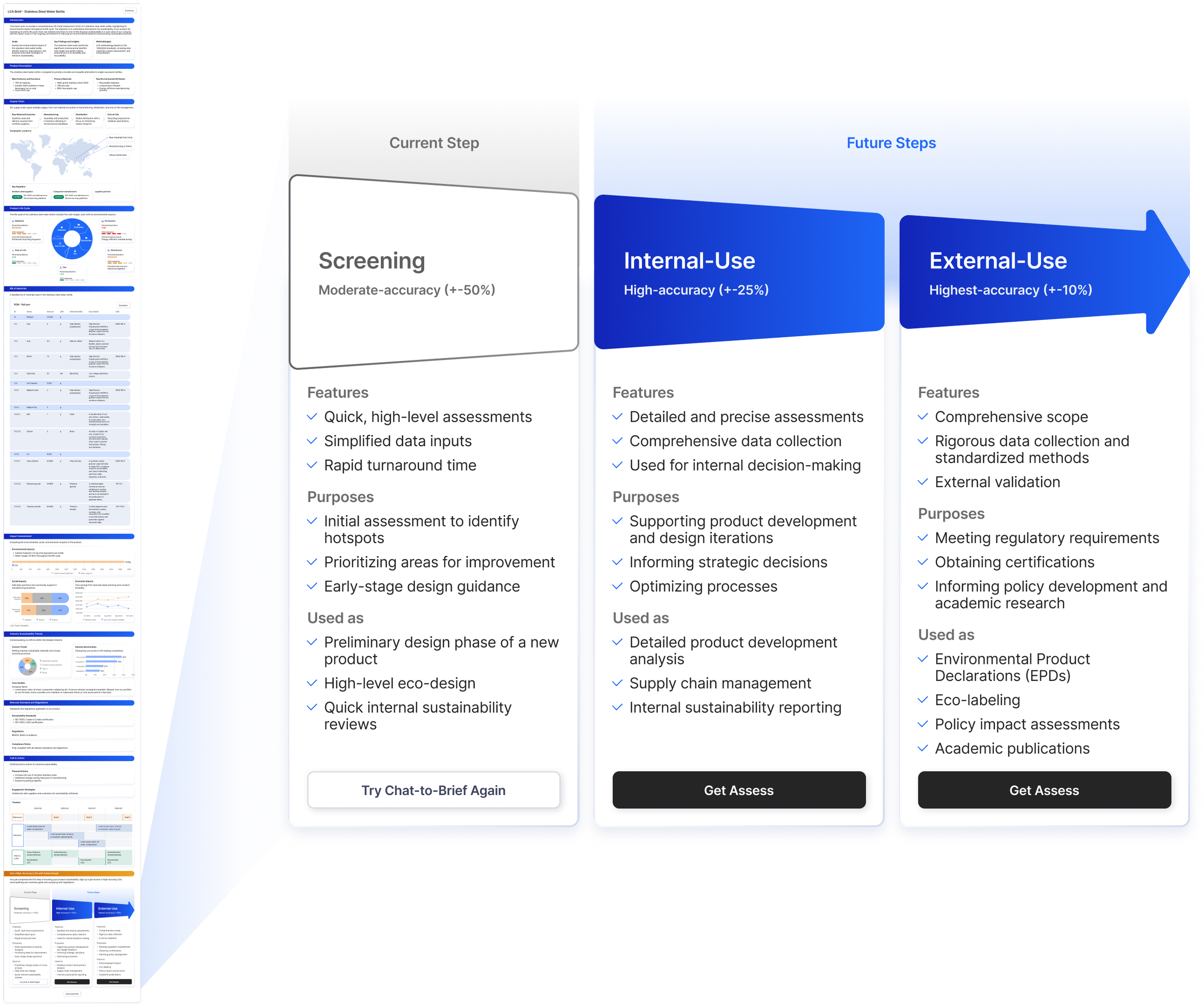
3. LCA Report and the Next Step
While EcoScan reports are considered as low-accuracy LCAs since most information is estimated and generated by AI, users can opt to join CarbonGraph and further analyze for high-accuracy LCAs.
Assessing Product Impact Was a Hassle
ORIGINAL CONCEPT
While there are tools online to calculate LCA, users often need to sign up, download or request demos in order to start. There was no easy way for users to quickly estimate multiple LCAs with limited effort. The lack of access to LCA estimation makes it difficult for professional or educational users to briefly understand environmental impact of products.
As a result, CarbonGraph came up with the idea of EcoScan, which allows users to briefly understand and estimate a product’s LCA by simply answer questions. EcoScan uses AI to fill in detailed information and generate impact reports in seconds. Although this would only be considered as an initial assessment which may be less accurate, the reports generated by EcoScan can be used for quickly assessing multiple product lines or educational purposes.
Challenges Users Faced With the Original Layout
By the time I joined the team, there was already an initial layout of the feature, which was plain and simple; however, the workflow was somehow overwhelming since users would need to endlessly answer questions in order to provide details of product description. I was tasked to design a smooth workflow with design-thinking and a clear assessment report that would be generated by the AI tool.
HOW MIGHT WE…
…help users quickly assess LCA without overcomplicating the process of gathering essential information of product description, manufacturing and supply chain?
What Are Users Thinking Throughout Assessment Process
EMPATHIZE + DEFINE
Due to time constraints, I quickly walked through the original process and gathered potential frustrations to better understand users.
Main Frustrations
Users do not always know what to input
Too many questions often overwhelm users
Lack of customization in response
Brainstorming Ideas for Better User Experience
After defining user pain points, I briefly conducted research on AI workflows to better understand how people normally interact with AI tools.
Potential Solutions
Introducing chips as suggestions for users
Organizing question patterns with process bar and skip option to avoid the overwhelming amount of questions
Including input box where users can manually provide detailed information regarding the products
EXPLORE
Sprinting Through Potential Solutions with Quick Testings
Based on the original layout and insights from my research, I created a couple versions of the design while applying the existing design system. Then, I conducted a few testings to reiterate the revised version.
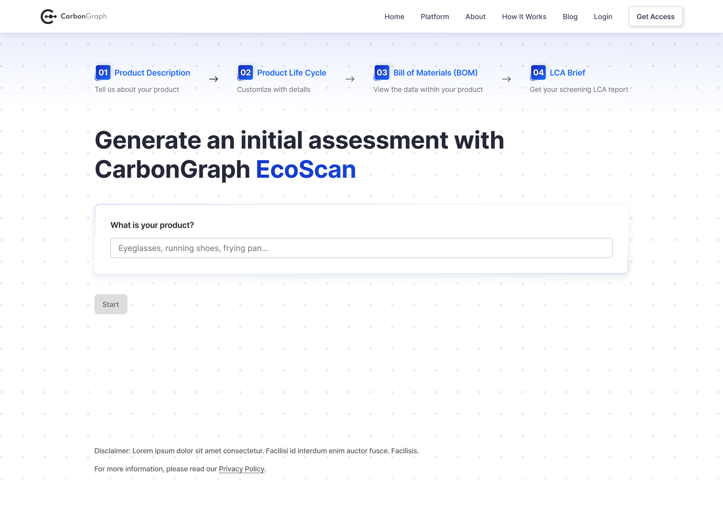
1. Landing Page: Start Assessing Right Away
❌ Before: Information Overload
Need an extra click to start the process
Showing too much information
✅ After: Clear Interface
Users can start the process right away
Display essential information for process preview
2. Assessment Stage: Intuitive UI with Clear Progress Bars
❌ Before: Unclear interface
Progress bar involves multiple content hierarchy
The BOM preview is overwhelming in size, making it difficult for users to focus on answering questions
✅ After: Intuitive interface
Cleaner interface with clear content in each progress bar
The BOM preview is sized down, creating more room and focus on the input boxes
What if We Could Make It More Intuitive Like a Chatbot
ALTERNATIVE APPROACH
During the process, I had the idea of designing a message flow for EcoScan where users can interact with the tool in the form of chatbot by either directly inputting necessary information or selecting a pre-generated option to complete tasks. While the idea was not considered at the time due to technical issues, I still designed the idea, showcasing the possible opportunity of EcoScan as an intuitive and modern AI chatbot.
TAKEAWAYS
What I Learned From the Project
Overall, I am very grateful to have the opportunity taking on this amazing project and working with the team at CarbonGraph. This is a unique experience where I have learned so much regarding environmental impact awareness.
If there was more time, I would further explore the design of the chatbot. I might focus on the placement of suggested chips or the copy writings. Besides the main features, I would also like to design the onboarding and tooltips, enhancing user experience.
Resources
More Projects
Next Project ❯
AboundSenses
Designing an effortless online art shopping experience for an early-stage startup
❮ Previous Project
SKINCAIR App
Designing AI powered app for personalized skincare routines


